

The main interactive charts — compiled by the Bernews Media Network using data from the Bermuda Government — are below, covering a range of data including all test results, positive cases, negative cases, deaths, active cases, total vaccinations and more.
All the charts are interactive, and if you hover your mouse or touch a point on a touchscreen phone/tablet for additional detail. The data starts in March 2020 and will be continuously updated.
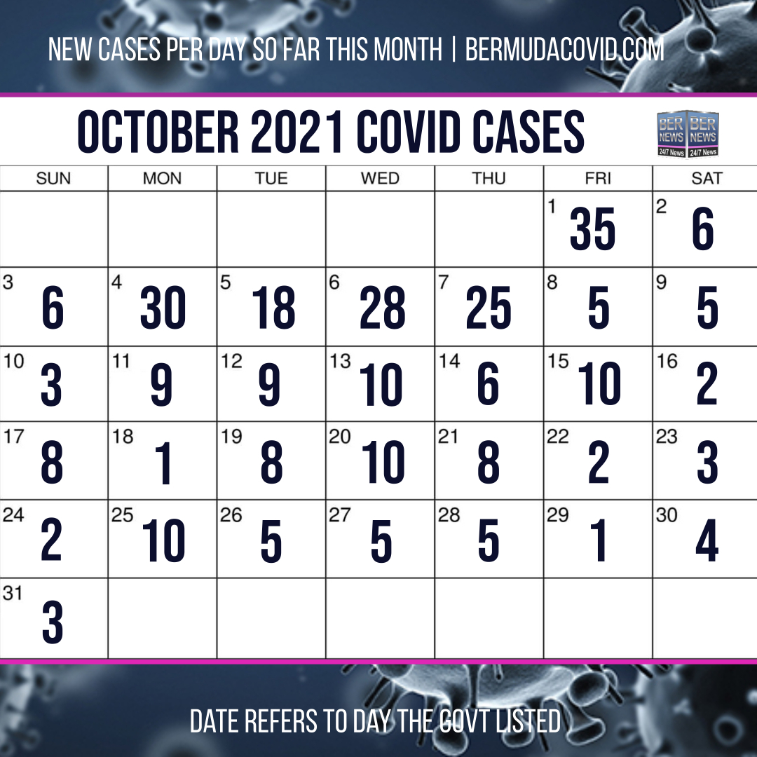
The charts below are not interactive, and just show a calendar view of the new cases announced per day since April 2021, please note that the calendar is only added below once the month has fully concluded, and to see the calendar updates on a daily basis, please see the articles containing the test results in the news section. The calendars do variate, up until September they are done by day of announcements and include deaths, from September [the worst month for the pandemic to date] onwards they are done by day of test results and do not include deaths.


